

Focus first on first-time fix rate, average response time and avoidable dispatch rate. Together, they control cost, capacity and customer satisfaction more than any other combination of numbers on a field service dashboard. Give each one an owner, put it on a weekly review, and you should see faster resolutions, lower cost per job and fewer frustrated customers within a couple of reporting cycles.
TL;DR:
- Focusing on first-time fix rate, response time, and avoidable dispatch rate can significantly reduce costs, improve capacity, and boost customer satisfaction when owners track them weekly.
- Defining clear measurement parameters for each KPI, including numerator, window, exclusions, and source, prevents drift and ensures consistent comparison across regions.
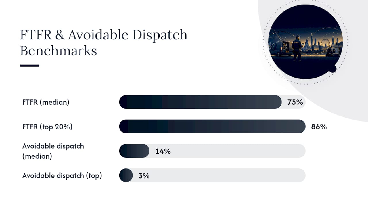
- Benchmark data indicates a median FTFR of 75% and an avoidable dispatch rate of 14%, with top performers reaching 86% and 3%, respectively, guiding realistic targets.
- Dashboards should be tailored to audience needs, using trend lines for long-term insights and geospatial visuals for identifying clusters of delays or avoidable dispatches.
- Combining all relevant data in an integrated system like Curcle allows real-time, accurate reporting, enabling faster action and reducing manual effort.
Table of Contents
- Field service metrics versus KPIs: getting the definitions right
- Core KPI categories every operations manager should include in reports
- Field service KPIs: formulas, benchmarks and one fix for each
- Building dashboards that actually get looked at
- Setting realistic benchmarks and a reporting cadence that sticks
- Turning reports into experiments that move the numbers
- What integrated data changes about reporting
- Why fewer, well-owned KPIs beat long metric lists
- Getting from reporting to action with Curcle
- Sources
- FAQ
Field service metrics versus KPIs: getting the definitions right
A metric is a raw number: jobs completed, minutes on site, parts used. A KPI is that same number measured against a target, over a defined window, tied to something the business actually cares about. "42 jobs this week" is a metric. "42 jobs against a target of 45, on a rolling seven-day window" is a KPI. The distinction sounds academic until two regional managers report wildly different first-time fix rates using the same underlying job data, purely because one counts a "fix" as closed-within-24-hours and the other counts it as closed-on-visit.
NIST's Cloud Service Metrics framework makes this explicit: a metric only becomes reproducible and useful for comparison when it specifies its numerator, denominator, measurement window, exclusions and data source. Skip any one of those and your reporting will drift, quietly, until the numbers stop meaning anything.
Before you report any field service metric, define:
- Numerator and denominator: what exactly is being counted, and against what total
- Measurement window: 24 hours, 7 days, 30 days, or per-job
- Exclusions: cancelled jobs, warranty visits, weather-related reschedules
- Data source: the field app, the CRM, or a manual log
Take first-time fix rate. Widen the resolution window from 24 hours to 7 days and your FTFR will climb, not because engineers got better, but because you are now counting slower fixes as successes. Any benchmark comparison against a 30-day industry figure becomes meaningless if your own window is different. Write the definition down once, share it across every regional office, and stop the argument before it starts.
Core KPI categories every operations manager should include in reports
Trying to report everything at once is how dashboards become wallpaper. Group your field service KPIs into five categories, and let each audience see only the ones relevant to their decisions.
Operational efficiency covers how well work gets done once a technician is on site or en route.
- First-time fix rate (FTFR): whether the job closes on the first visit
- Mean time to repair (MTTR): total time from job opening to resolution
- Technician utilisation: billable or productive hours against total available hours
- Jobs completed per technician: throughput per person, per shift or per week
Scheduling and dispatch governs how work gets assigned before a van even leaves the yard.
- Avoidable dispatch rate: visits that could have been resolved remotely or prevented with better triage
- On-time arrival rate: percentage of jobs where the technician arrives inside the promised window
- Schedule adherence: how closely actual visits match the planned schedule
- Response time: elapsed time from job logged to technician assigned or en route
Customer experience tells you how the work felt from the other side of the door.
- Customer satisfaction score (CSAT): post-job rating, usually 1 to 5
- Net Promoter Score (NPS): likelihood to recommend, tracked quarterly or per contract renewal
- Complaint rate: complaints per 100 jobs
- Repeat visit rate: jobs requiring a second or third callout within a defined window
Financial and commercial metrics connect operations to the numbers finance actually cares about.
- Cost per job: labour, parts and travel divided by jobs completed
- Revenue per technician: billable output per head, useful for capacity planning
- Contract margin: profitability per SLA or maintenance contract
- Invoice-to-payment cycle time: how long cash takes to land after a job closes
Asset and compliance metrics matter most for regulated or certification-heavy trades.
- Certificate renewal rate: percentage of assets with in-date compliance documentation
- Asset failure rate: breakdowns per asset per year, useful for predicting replacement cycles
- Audit pass rate: proportion of compliance checks passed first time
Allocate these across three reporting tiers. Daily operational tiles for the dispatch team need response time, on-time arrival and today's job count, refreshed live. Weekly team dashboards for regional managers should carry FTFR, avoidable dispatch rate, utilisation and cost per job, reviewed as a trend. Monthly executive reports need only three to five headline signals: FTFR, CSAT, contract margin and compliance pass rate, framed as direction of travel rather than raw numbers.
Field service KPIs: formulas, benchmarks and one fix for each
Here is the working set of field service reporting metrics most UK operations teams should track, with the calculation, a sensible measurement window, a realistic target band, and the single lever that moves the number fastest.
-
First-time fix rate (FTFR). Formula: (jobs resolved on first visit ÷ total jobs) × 100, measured over a rolling 30 days. Aquant's 2025 benchmark data puts the median at 75%, with top performers reaching 86% and the weakest quartile sitting at 53%. The most common misdefinition pitfall is excluding warranty or goodwill visits inconsistently between sites. Lever: better pre-visit diagnostics and parts staging based on job history.
-
Avoidable dispatch rate. Formula: (dispatches that could have been resolved remotely ÷ total dispatches) × 100. Aquant's 2025 data shows a median of 14%, with the strongest operators at just 3%. Pitfall: not distinguishing "avoidable" from "unnecessary" (some avoidable dispatches are contractually required). Lever: remote triage before booking, using photo or video diagnostics.
-
Mean time to repair (MTTR). Formula: total time from fault reported to job closed, averaged across a job type or asset category. Watch for a pitfall where paused jobs (waiting on parts) inflate the average unfairly. Lever: pre-stock common failure parts by asset type.
-
Average response time. Formula: time from job logged to technician dispatched or en route, measured per SLA tier. PagerDuty's service performance guidance treats this alongside MTTA as a core operational health signal. Lever: geographic dispatch zoning to cut travel-driven delay.
-
Technician utilisation. Formula: (billable hours ÷ available hours) × 100, tracked weekly. Pitfall: chasing high utilisation alone can starve FTFR, since rushed jobs get scheduled tighter. Lever: build small buffers into the schedule for urgent or complex jobs.
-
On-time arrival rate. Formula: (visits arriving within the promised window ÷ total scheduled visits) × 100. Lever: real-time traffic-aware scheduling rather than static appointment slots.
-
Jobs per technician. Formula: completed jobs ÷ technician headcount, per week. Useful for capacity planning, not for performance ranking alone since job complexity varies.
-
CSAT and NPS. CSAT: average post-job rating (1 to 5). NPS: percentage promoters minus percentage detractors, from a 0 to 10 recommendation question. Pitfall: response bias if only satisfied customers reply. Lever: automate the survey trigger immediately after job closure.
-
SLA compliance. Formula: (jobs meeting contracted response and resolution times ÷ total contracted jobs) × 100. Lever: build SLA countdown alerts into the dispatch view.
-
Cost per job. Formula: (labour + parts + travel) ÷ jobs completed, by job type. Lever: track cost per job against FTFR, since a "cheap" job that needs a return visit rarely stays cheap.
-
Remote resolution rate. Formula: (issues closed without a site visit ÷ total logged issues) × 100. Lever: expand remote diagnostic tooling for your highest-volume fault categories.
A failed first visit typically triggers 2.7 total visits and adds roughly 13 days to full resolution, according to Aquant's benchmark analysis. That single number is why FTFR sits at the top of most operations managers' priority list. It touches cost, technician capacity and customer patience all at once.
Building dashboards that actually get looked at
A dashboard nobody opens twice is worse than no dashboard at all. Match the chart type to what the metric is trying to show, not to what looks impressive.
Trend lines work best for FTFR and CSAT, because the direction over 8 to 12 weeks matters more than any single week's figure. Stacked bar charts suit repeat-visit causes, since operations managers need to see whether repeat visits stem from parts shortages, misdiagnosis, or access issues, not just the total count. Heat maps earn their place for geography and time, showing where response time or avoidable dispatch spikes cluster by region or hour of day.
Design each dashboard for its audience rather than reusing one view for everyone.
- Dispatch team: live response time, today's job queue, SLA countdown alerts
- Regional operations: weekly FTFR trend, utilisation, avoidable dispatch rate by depot
- Executive summary: monthly FTFR, contract margin, compliance pass rate, customer satisfaction
The interactive features that turn a dashboard from decorative to genuinely useful are drill-down by asset, engineer or site, SLA overlays showing breach risk before it happens, anomaly alerts when a metric moves outside its normal band, and a linked playbook so a manager who spots a spike in avoidable dispatch rate can click straight through to the corrective checklist rather than starting from scratch.
Pro Tip: If a chart doesn't change a decision within 30 seconds of looking at it, it belongs in an appendix, not the main dashboard.
Setting realistic benchmarks and a reporting cadence that sticks
Benchmarks only help if you know where your business genuinely sits before comparing it to anyone else. Aquant's 2025 benchmark data puts median FTFR at 75%, with the top 20% of operators reaching 86%. For avoidable dispatch rate, the same research shows a median of 14% against a top-performer figure of just 3%.
Use those numbers as calibration, not a scoreboard. Measure your own baseline over a defined 30 day window first. Then set a realistic short-term target, perhaps closing a third of the gap to the industry median within a quarter, and a 12-month stretch target aimed at the top-quartile figure. Practical field service management guidance recommends assigning a named owner to each KPI and starting weekly reviews as soon as the baseline is set, rather than waiting for a "perfect" measurement system.
Cadence matters as much as the target itself:
- Daily: operational tiles for dispatch, reviewed by team leads
- Weekly: team dashboards for regional or depot managers, reviewed in a standing 30-minute meeting
- Monthly: executive summaries, reviewed by operations directors and finance
Skip a cadence level and metrics either drown in daily noise or arrive too late for anyone to act on them.
Turning reports into experiments that move the numbers
A metric that flatlines for three months without an experiment attached to it is just decoration. Once a KPI slips outside its target band, treat it as a hypothesis to test, not a fact to accept.
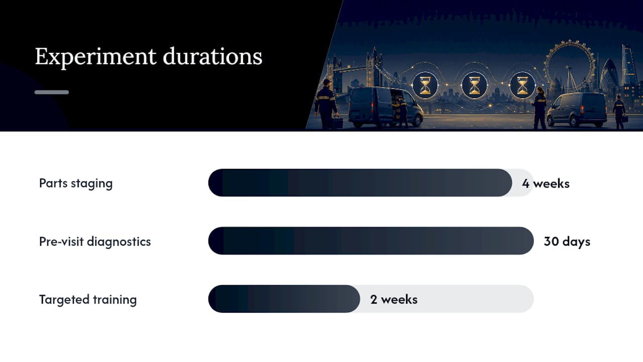
- Parts staging: pre-load vans with the top five fault-code parts for a given asset category, and track FTFR over four weeks.
- Pre-visit diagnostics: require a photo or remote video check before dispatch, and measure the change in avoidable dispatch rate over 30 days.
- Targeted training: pair technicians with the lowest FTFR on a specific job type with a mentor for two weeks, then remeasure.
- Schedule padding: add a 15-minute buffer around urgent job types and track the effect on on-time arrival rate.
Each experiment needs a hypothesis, the metric it targets, a duration (30 to 90 days works for most), a named owner, and an expected direction of movement stated before you start, not after.
Pro Tip: Set a rollback rule before you launch an experiment. If avoidable dispatch rate hasn't moved after 60 days, stop the trial and try the next lever rather than letting it run indefinitely.
What integrated data changes about reporting
Luke Herridge built Curcle out of a real UK service and engineering business, where reporting friction usually came from data scattered across spreadsheets, paper certificates and three different systems that didn't talk to each other. When job records, asset history and compliance documents sit in one place, a first-time fix report or an audit-ready export takes one click instead of an afternoon. Role-based dashboards mean a dispatch lead and a finance director see the same underlying data, filtered to what each one needs to act on.
Why fewer, well-owned KPIs beat long metric lists
Most reporting failures come from too many KPIs, not too few. Six to ten metrics with a named owner each will outperform a 30-tile dashboard nobody reviews properly. Watch for the two classic traps: chasing utilisation while FTFR quietly slides, and quietly widening a measurement window until a vanity metric looks better. Before adding any metric, ask whether someone actually owns it and whether it changes a decision. If not, cut it.
— Luke Herridge
Getting from reporting to action with Curcle
Curcle is built for operations managers who have outgrown spreadsheets and disconnected reporting tools. Because job data, asset records, compliance certificates and invoicing all sit in one connected system, the KPIs covered above, FTFR, avoidable dispatch rate, SLA compliance, cost per job, pull straight from a single source of truth rather than three exports stitched together manually.

That matters most for compliance-led trades, where an audit-ready export needs to be accurate on the first request, not reconstructed under pressure. Curcle's role-based dashboards give dispatch teams, regional managers and directors their own view of the same live data, cutting the time between spotting a metric slip and doing something about it. If you want to see how job, asset and compliance data flow into a single reporting view, take the product tour or check current plans on the pricing page.
Sources
For definitions and reproducible measurement, NIST's Cloud Service Metrics framework sets out the components every metric needs. For industry benchmarks, Aquant's 2025 field service data covers FTFR and avoidable dispatch rate ranges. For incident-style metrics like MTTA and MTTR, PagerDuty's service performance documentation offers a useful reference model.
- Service benchmarks across 5 key KPIs — Field Service News
- NIST Special Publication 500-307: Cloud Service Metrics
- Service performance insights — PagerDuty support
FAQ
What are the most important field service KPIs to start with?
Start with first-time fix rate, average response time and avoidable dispatch rate. These three jointly influence cost, technician capacity and customer satisfaction, and give you enough signal to run weekly reviews without overwhelming the team with data.
What is a good first-time fix rate benchmark?
Aquant's 2025 benchmark data puts the median FTFR at 75%, with top-performing operators reaching 86%. Anything below the bottom 20% benchmark suggests diagnostic or parts-availability problems worth investigating.
What is the difference between SLA and KPI in field service?
An SLA is a contracted commitment to a customer, such as a four-hour response window. A KPI is the internal measure used to track whether you're meeting that commitment, like SLA compliance rate calculated as a percentage of jobs meeting the agreed timeframe.
How often should field service reports be reviewed?
Operational tiles need daily review by dispatch leads, team dashboards need weekly review by regional managers, and executive summaries need monthly review by operations directors. Matching cadence to audience prevents both information overload and slow reaction to problems.
Can field service software calculate these metrics automatically?
Platforms that connect job scheduling, engineer data and compliance records, such as Curcle, can generate metrics like FTFR, avoidable dispatch rate and cost per job directly from live job data rather than manual spreadsheet exports. This removes most of the definitional inconsistency that causes benchmark comparisons to break down.