

Run seven dashboards: service operations, scheduling and workforce, engineer performance, customer satisfaction, SLA and compliance, resource and inventory, and financial. The rule that makes them work is MOTA: every metric must be Measurable, Owned, Timely, and Actionable, and a working dashboard should be readable in under three minutes. Aim for roughly 60/40 split between leading and lagging metrics, so you catch problems before they cost money, not just after.
- Build these first: service operations, SLA/compliance, and financial dashboards
- Add next: scheduling, engineer performance, customer satisfaction, inventory
- Governing rule: no metric survives without an owner and a defined action
A compact operating dashboard holds 12 to 18 metrics across four to six sections. Anything wider than that stops being a dashboard and becomes a report nobody reads.
Key Takeaways
Field service dashboards only work when every metric on screen has a named owner, a review cadence, and a defined action attached to it.
| Point | Details |
|---|---|
| Build seven core dashboards | Prioritise service operations, SLA/compliance, and financial dashboards first, then add scheduling, engineer performance, satisfaction, and inventory. |
| Apply the MOTA filter | Keep only metrics that are Measurable, Owned, Timely, and Actionable; cut anything without a named owner. |
| Balance leading and lagging metrics | Aim for roughly 60% leading indicators so you catch problems before they show up in lagging numbers. |
| Keep it readable | Limit dashboards to 12 to 18 metrics across four to six sections so they're readable quickly. |
| Consolidate your data | Curcle unifies scheduling, certificates, and invoicing in one system, supporting invoice collection rate improvements for its users. |
Table of Contents
- What are the main types of field service dashboards?
- How do you choose the right KPIs for a field service dashboard?
- What design rules keep a dashboard actually usable?
- How should compliance dashboards handle certificates and SLAs?
- How do you roll out field service dashboards in 90 days?
- What I've learned building dashboards for compliance-led trades
- Putting this checklist into practice with Curcle
- Where to go next for dashboard templates and compliance guidance
- Frequently asked questions
- Sources
What are the main types of field service dashboards?
Most field service businesses need seven dashboards, each built for a different decision, not a different department.
-
Service operations dashboard. The command centre view: jobs open, jobs completed, engineers on site, and jobs at risk of missing target. Owned by the operations manager, refreshed live throughout the day. This is what operational dashboards are built for: high-frequency monitoring that supports immediate correction, not end-of-month reflection.
-
Scheduling and workforce dashboard. Tracks engineer utilisation, travel time between jobs, and ETA adherence. A scheduler owns this one, and it should be checked hourly during busy periods, because a single missed ETA cascades through the rest of the day's route.
-
Engineer performance dashboard. Jobs completed per technician, first-time fix rate, and certification status. Line managers own this and review it weekly, using it for coaching conversations rather than public leaderboards.
-
Customer satisfaction dashboard. CSAT or NPS scores alongside average response time. Customer service leads review this weekly, watching for dips tied to specific engineers or job types.
-
SLA and compliance dashboard. Breach rates and overdue certificates, reviewed daily by whoever owns contractual risk.
-
Resource and inventory dashboard. Stock levels and parts availability by depot or van, checked daily by whoever controls purchasing.
-
Financial dashboard. Collected revenue and outstanding invoices, reviewed weekly by finance and monthly by the leadership team.
Field service platforms typically expose pre-built dashboards covering resource status and engineer productivity, which shows how standard this seven-dashboard shape has become across the industry.
How do you choose the right KPIs for a field service dashboard?
Every KPI candidate should pass the MOTA test before it earns a place on any dashboard. Ask whether it is Measurable with data you actually collect, Owned by a named person, Timely enough to act on before the moment passes, and Actionable, meaning it triggers a specific response when it moves.
The second filter is the leading/lagging balance. Lagging metrics (revenue collected, jobs completed) tell you what already happened. Leading metrics (open jobs approaching SLA breach, engineer travel time creeping upward) let you intervene first. Amplitude's guidance suggests roughly 60% of your dashboard be leading indicators, because a dashboard full of lagging metrics only confirms damage after it's done.
Some KPI examples worth building into your operations metrics dashboard:
- Jobs per technician — owner: line manager, cadence: weekly
- SLA breach rate — owner: compliance lead, cadence: daily
- Invoice collection rate — owner: finance, cadence: weekly
- Mean time to arrival — owner: scheduler, cadence: daily
The most common failure mode here is tracking vanity metrics: numbers that look impressive in a board pack but map to no owner and no action. If a metric moves and nobody's job description changes as a result, cut it.
Pro Tip: Before adding any new KPI, write down the exact action someone takes when it goes red. If you can't finish that sentence, the metric doesn't belong on the dashboard yet.
What design rules keep a dashboard actually usable?
A dashboard that takes ten minutes to interpret has already failed. Put the three or four numbers that matter most in the top left, where eyes land first, and push detail into drill-downs rather than cramming everything onto one screen.
- Use colour and thresholds sparingly. Red should mean "act now," not "something is slightly off" — overuse trains people to ignore it.
- Set automated alerts and assignments so a breached threshold routes straight to the right person, instead of waiting for someone to notice.
- Design for mobile and offline use. Engineers in a plant room with no signal still need to check a certificate status or attach a photo, and the dashboard has to work when the connection doesn't.
- Keep drill-ins simple: one tap from summary card to job detail, not a five-screen maze.
These aren't cosmetic choices. A cluttered dashboard causes the same failure as no dashboard at all: decisions made on gut feel because nobody could find the number in time.
How should compliance dashboards handle certificates and SLAs?
Compliance dashboards work differently from operational ones because a single control often satisfies several obligations at once. Mapping one control to multiple regulatory requirements means updating one certificate, gas safety, EICR, LOLER, or F-Gas, automatically refreshes every linked status, instead of someone re-entering the same data three times.
- Track certificate expiry with automatic escalation windows, not a static spreadsheet column
- Show SLA breach rate with a named owner attached to every remediation step
- Flag overdue renewals before the compliance deadline, not on it
A working compliance dashboard should hold roughly the same discipline as any other: 12 to 18 metrics, readable quickly. Compliance data doesn't need more volume, it needs faster escalation.
How do you roll out field service dashboards in 90 days?
- Map your data sources. Jobs, timesheets, invoicing, CRM, telematics, and certificate records all feed dashboards, but only if the underlying data is clean. Fix bad data before building anything on top of it.
- Assign owners and cadence. Daily cards for operations and compliance, weekly reviews for performance and finance, monthly trend reviews for leadership.
- Build three quick wins in week one: SLA breaches, jobs per technician, outstanding invoices.
- Follow a 90-day roadmap. A sensible build sequence runs three live cards in week one, pilots with the operations lead through weeks two to four, extends to weekly leadership review by week eight, and consolidates targets and owners by week twelve.
The most common trap is integration debt: three systems reporting slightly different job counts because nobody agreed on a single source of truth. Fix that before adding a fourth data source, not after.
What I've learned building dashboards for compliance-led trades
Field service businesses rarely fail because they lack data. They fail because that data sits in four systems that don't talk to each other, and by the time anyone reconciles it, the job is three weeks old. That's the pattern behind Curcle: consolidating scheduling, certificate generation, and invoicing into one place, because compliance-heavy trades can't afford a dashboard built on stitched-together exports.

Putting this checklist into practice with Curcle
Curcle is built around the exact checklist above, not as an afterthought but as the core of the platform: job scheduling, certificate generation, and invoicing sit in one system, so your service operations, SLA/compliance, and financial dashboards are pulling from a single source of truth rather than three exports that never quite match.
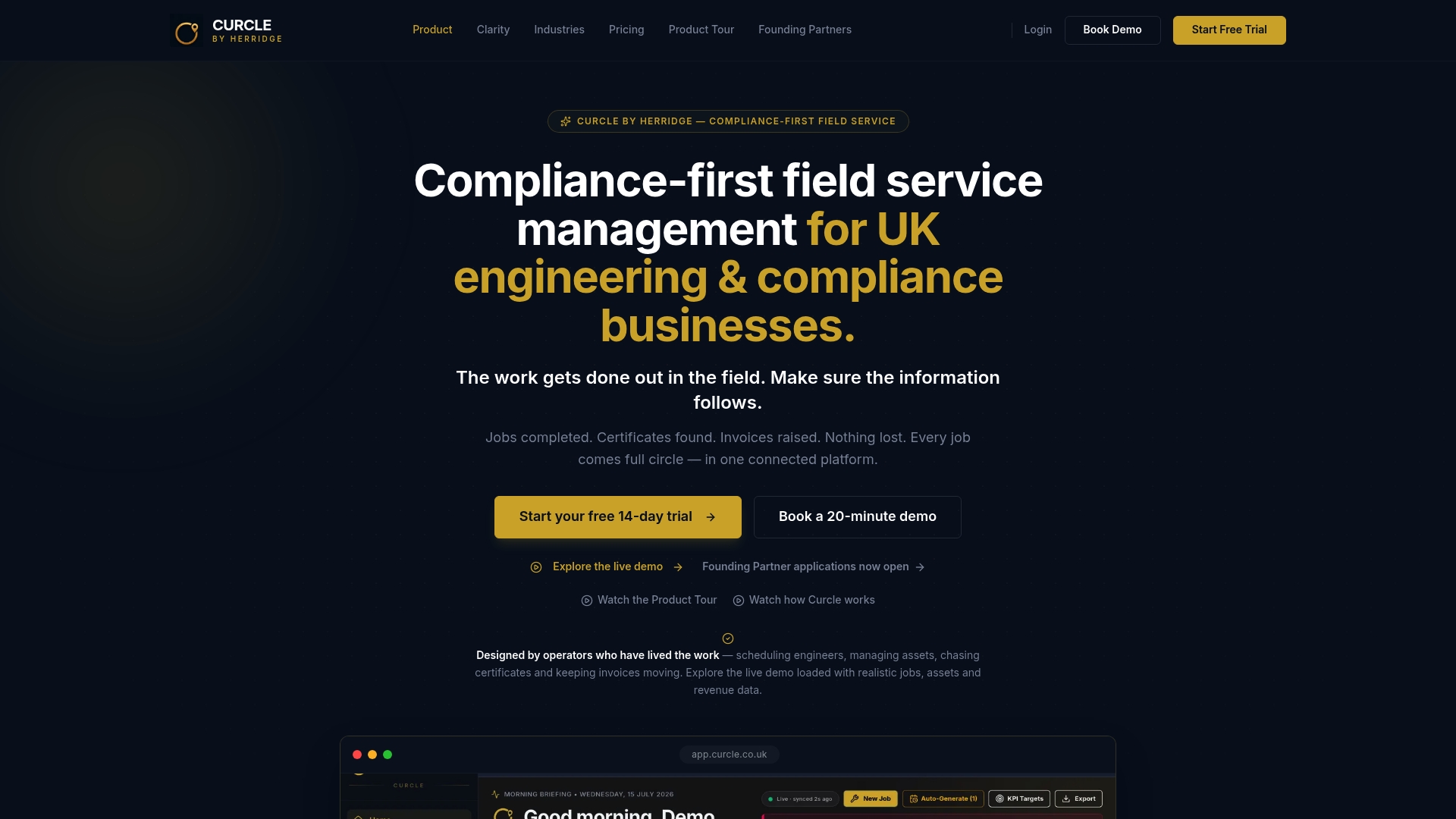
That matters most for the compliance dashboard, where a single completed job can update Gas Safe, EICR, or LOLER status automatically instead of requiring three separate updates. The features page breaks down how dashboards, certificate tracking, and reporting connect, and the free compliance templates give you a starting point for certificate registers even before you commit to a platform. If you want to see the dashboards working on real job data rather than a slide deck, book the product tour and bring your own SLA breach numbers to the call.
Where to go next for dashboard templates and compliance guidance
For build-your-own guidance, Smartsheet's overview of operations dashboards explains how tactical and operational dashboards differ, and GetFairview's operating dashboard template sets out the MOTA framework in full. For onboarding a new platform, Ample Express's field service software checklist is a solid practical companion. For compliance certificate records, Curcle's free templates cover CP12, EICR, and LOLER.
Frequently asked questions
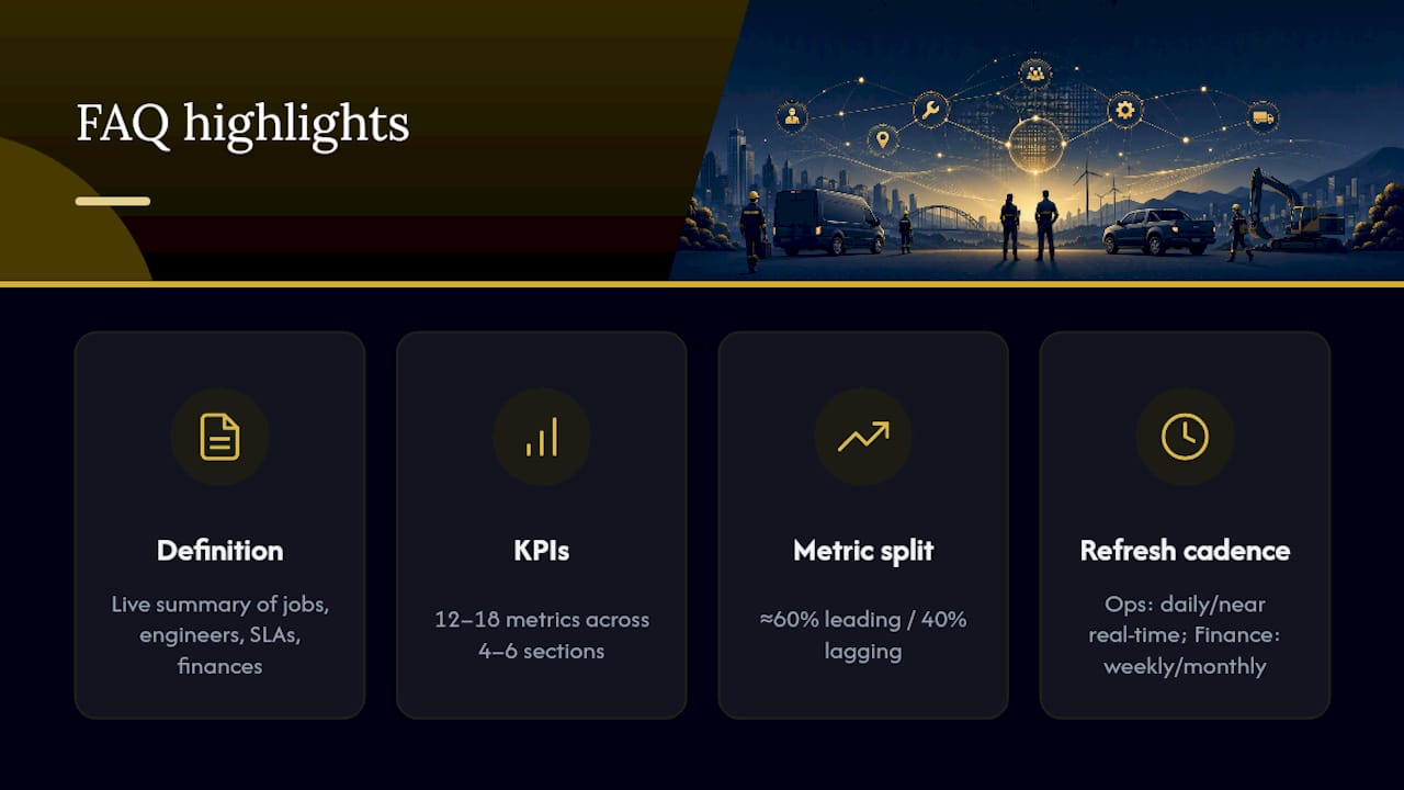
What is a field service dashboard? A field service dashboard is a live visual summary of jobs, engineers, SLAs, or finances that lets an operations leader see what's happening and act on it, rather than waiting for an end-of-week report.
How many KPIs should a field service dashboard show? Somewhere between 12 and 18 metrics across four to six sections keeps a dashboard genuinely readable. Beyond that, it stops being a quick decision tool and turns into a document.
What's the difference between leading and lagging metrics in a service dashboard? Lagging metrics report what already happened, like revenue collected. Leading metrics warn you before it happens, like jobs approaching SLA breach. A roughly 60/40 leading to lagging split tends to work best for operational teams.
How often should field service dashboards be updated? Operational and compliance dashboards need daily or near real time updates, since they drive immediate action. Financial and performance dashboards can run on a weekly or monthly cadence.
What makes a compliance dashboard different from a standard operations dashboard? A compliance dashboard tracks certificate expiry, renewal workflow, and SLA obligations, often mapping one completed control to several linked regulatory requirements so nothing gets updated twice or missed once.
Sources
- Starter guide to dashboards — Klipfolio
- Dashboard design: 5 pitfalls to avoid — Silvon
- Operating dashboard template — GetFairview